Page 5 of 9
Re: Cool Maps
Posted: Mon Mar 27, 2017 2:22 am
by Typhoon
Re: Cool Maps
Posted: Mon Mar 27, 2017 12:16 pm
by Simple Minded
Fascinating map, but also very misleading. Excellent example of how the human jumps to the mental shorthand of binary mode.
Less than 900 people per square mile black areas are assumed to be "un-populated," more than 900 people per square mile yellow areas are assumed to be "over-populated."
Kinda like red-state blue-state maps of the US.
Where the lines are drawn are yuge in deciphering the data.
Is it true that all the AGW temperature sensors are placed in yellow areas?
Re: Cool Maps
Posted: Tue Mar 28, 2017 3:21 am
by noddy
the same map yet again, this time via light brightness
 http://darksitefinder.com/maps/world.html
one thing that stands out is the northern indian strip is completely different. wonder why ?
Re: Cool Maps
Posted: Tue Mar 28, 2017 11:38 am
by Simple Minded
bright and dark? meaning IQ and skin color? What?
Re: Cool Maps
Posted: Fri Dec 29, 2017 2:35 am
by Typhoon
Re: Cool Maps
Posted: Thu Feb 01, 2018 6:36 pm
by Apollonius

From:
In this 2018 map, Metro Vancouver turns red with single-family homes worth $1M or more - Jesse Ferreras,
Global News, 9 January 2018
https://globalnews.ca/news/3953603/in-t ... m-or-more/
A single-detached home owned by a non-resident in the City of Vancouver, for example, was worth $3,638,500 on average, 26 per cent more than a resident’s home.
Re: Cool Maps
Posted: Fri Feb 02, 2018 9:14 am
by noddy
all that sweet sweet corruption money from asia and the middle east.
Re: Cool Maps
Posted: Wed Feb 21, 2018 5:18 am
by Typhoon
Re: Cool Maps
Posted: Fri Feb 23, 2018 9:46 am
by Mr. Perfect
Population distribution in India is fascinating.
Re: Cool Maps
Posted: Sat Feb 24, 2018 6:33 pm
by Typhoon
Q-FTxVhFWWw
B1BTSI-d2sw
Re: Cool Maps
Posted: Wed May 02, 2018 12:09 pm
by Parodite
IpKqCu6RcdI
Re: Cool Maps
Posted: Sun Sep 16, 2018 8:26 am
by Typhoon
UY9P0QSxlnI
Re: Cool Maps
Posted: Sat Nov 10, 2018 2:13 am
by Parodite
Re: Cool Maps
Posted: Sat Nov 10, 2018 3:07 pm
by Simple Minded
First thought: Only 953 hate groups in the US?!?! Sounds like a low count to me! Lazy bastards at SPLC!
There's probably at least 953 Christian religious denominations in the US. Add in height, weight, sex, age, skin color, income, region, hyphenated american groups, occupation, etc. Accurate count has to be closer to 10,000,000.
Second Thought: White Knights get to define hate groups. Hate groups are dragons.
Third thought: "You rubes need us White Knights to save you from the dragons. Send money!" probably works better than "I am a Nigerian Prince......."
Simplification: These are the 953 groups that people at SPLC hate and is targeting cause they want other people to hate them also.
Re: Cool Maps
Posted: Wed Nov 28, 2018 2:54 am
by Apollonius
Historical Atlas of the Eight Billion
EI1ho7JjXa4
From:
Historical Atlas of the Eight Billion: World Population History 3000 BCE to 2020 by John Carl Nelson (A World History Maps Book, 2014)
The maps and the presentation are absolutely fascinating and full of all sorts of wonderful details hard to pinpoint in more general books on population history, much less books which cover history in a broader sense.
I like the way the author divides the world up into 24 regions (e.g., Eastern North America; Western North America) and compares population trends in each over time.
He also provides lists of the world's most populous countries and cities for each of the different time periods he maps.
The author provides compare-at-a-glance statistical tables which show percentages of world population for various regions in each time period mapped and the really striking thing is that:
1. Over the last 5000 years South Asia and East Asia have each always contained approximately 25% of the world's total human population.
2. Europe (excluding Russia and Ukraine) currently has about 7% of the world's population, down from 14% in 1950 and 18% in 1900. Even in the aftermath of the collapse of Rome, Dark Ages Europe still held about 12% of the total. The last time it was below 10% was in ca. 1500 BC.
Re: Cool Maps
Posted: Mon Dec 31, 2018 12:08 am
by Apollonius
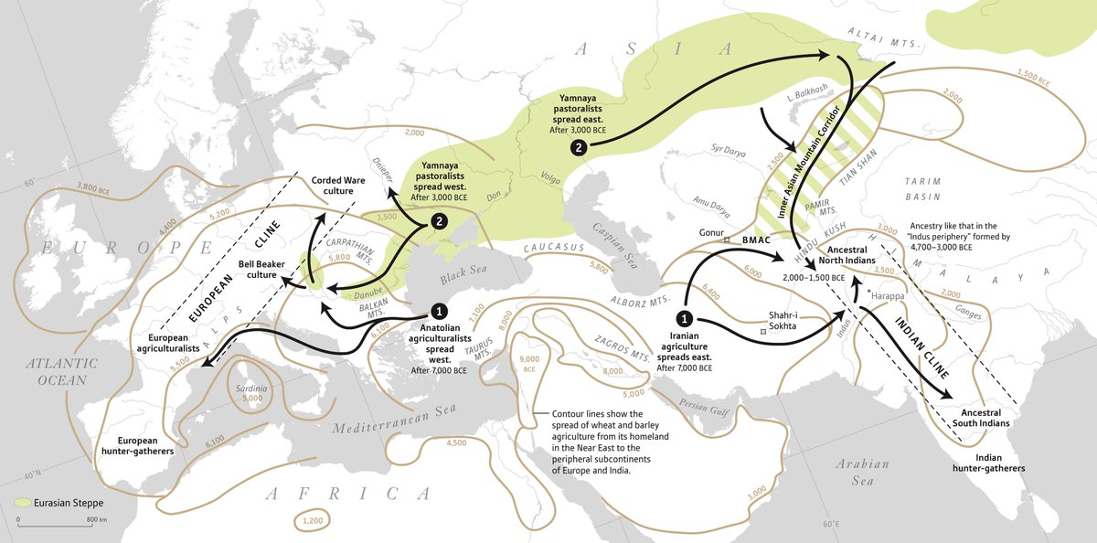
This map appears in the book
Who We Are and How We Got Here: Ancient DNA and the New Science of the Human Past by David Recih (Oxford University Press, 2018) with the title 'A Tale of Two Subcontinents'.
Link to full image:
https://pbs.twimg.com/media/DZobIp0WAAEfT12.jpg
Re: Cool Maps
Posted: Sat Jan 05, 2019 1:31 am
by noddy
that is definately an intertesting map.
Re: Cool Maps
Posted: Sat Jan 05, 2019 2:37 am
by Apollonius
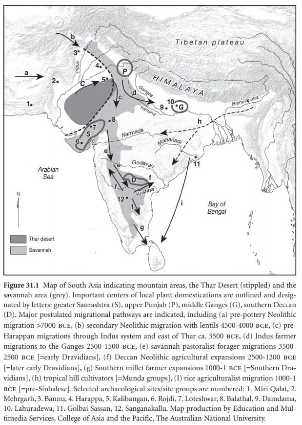
From:
The Munda arrived in India 4,000 years ago (probably) - Razib Khan, 21 September 2018
http://www.razib.com/wordpress/?cat=786
Source:
The genetic legacy of continental scale admixture in Indian Austroasiatic speakers - Kai Tätte ... [et al.],
bioRxiv, 21 September 2018
https://www.biorxiv.org/content/early/2018/09/20/423004
Re: Cool Maps. Coolest yet.
Posted: Sat Jan 05, 2019 4:18 am
by Nonc Hilaire
Re: Cool Maps
Posted: Tue Mar 05, 2019 7:49 am
by Typhoon
The Odyssey Map
A map of the locations in Homer's Odyssey
Men are so quick to blame the gods: they say that we devise their misery.
But they themselves - in their depravity - design grief greater than the griefs that fate assigns.
― Homer, The Odyssey
Re: Cool Maps
Posted: Thu Mar 21, 2019 6:23 am
by Typhoon
Now online.
The David Rumsey Map Collection
The David Rumsey Map Collection Database has many viewers and the Blog has numerous categories. The physical map collection is housed in the David Rumsey Map Center at the Stanford University Library.
The historical map collection has over 90,000 maps and related images online. The collection includes rare 16th through 21st century maps of America, North America, South America, Europe, Asia, Africa, Pacific, Arctic, Antarctic, and the World.
Re: Cool Maps
Posted: Mon Mar 25, 2019 4:12 am
by Typhoon
Re: Cool Maps
Posted: Tue May 07, 2019 9:50 pm
by Typhoon
Re: Cool Maps
Posted: Wed May 08, 2019 4:36 am
by noddy
the incredible importance of Istanbul (not Constantinople ) stands out so much in that map.
Re: Cool Maps
Posted: Sat May 11, 2019 10:43 pm
by Typhoon
noddy wrote:
the incredible importance of Istanbul (not Constantinople ) stands out so much in that map.
Quite.
Pity Erdogan is so fixated on playing the "strong man" instead of positioning Turkey to again benefit from its location.


